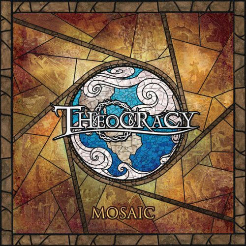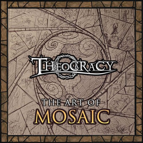
10/06/23: Early this week – Harmon Caldwell, our website designer, had the chance to catch-up with artist Steven Howard, to discuss the history & ideas behind his already iconic – “Mosaic” album art. On top of that we thought it would be cool to show you some of Steven’s early drafts & some initial “behind the scenes” sketches of what ultimately became the final “Mosaic” art masterpiece. We hope you enjoy it!
Steven, how did you originally begin to work with the band and present your ideas for the potential album art?
Way back in 2017 I had created a fan-art digital-stained-glass poster for my all-time favorite band, Theocracy. Over time I got to connect with some of the members and had offered that if they were ever in need of any art to let me know. Through a series of events and after talking with Matt, I was asked to create art for their upcoming album – “Mosaic”.
Starting in 2020, after learning the title and theme/idea of the album, I sketched out three concepts within about an hour and sent them over to Matt to see what he thought.
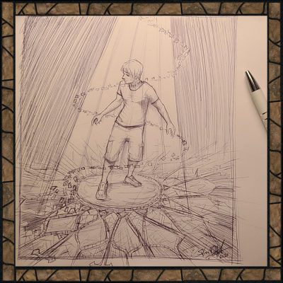
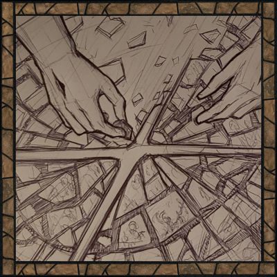
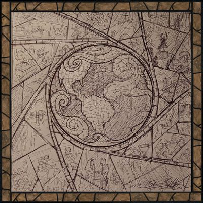
Interesting that the original color THEME for the ALBUM ART was Purple…
Yes, the initial color wasn’t really working so I thankfully changed it over time to the rustic color you see on the final.
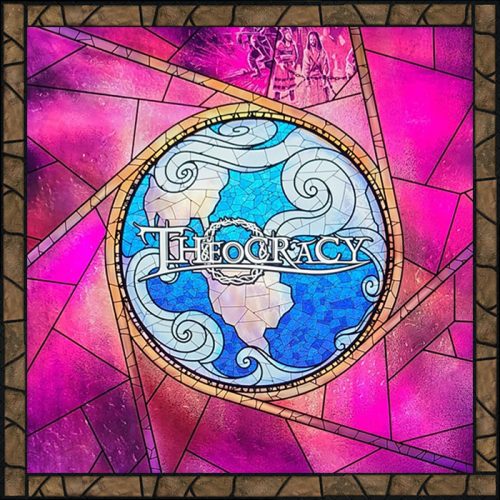
if you would, tell us a little about the mosaic idea and the effects themselves… just how did you make it look this cool?
I have a collection of mosaic and stained glass elements I have been using on art (including the original poster I did for Theocracy) and used many of these elements combined with Photoshop filters and effects to begin capturing that mosaic tile effect. At this point I also began sketching out in more detail each tile which depicts various stages of life to capture the beautiful lyrics of Mosaic “An unknown future, broken past. Like imperfect panes of glass. Revealing the larger grand design.” The idea was to depict the 10 songs and other various moments of life flowing into the globe showing a grand design which God is master over. Just to the top right of the globe you can see a tile for Red Sea which was a sketch I had made for potential art for the album before I knew the title. I think it will be fun for listeners to hear the lyrics and see which tile matches up to which song.
What was the timeline on your design stage? Has the album art been completed for a while?
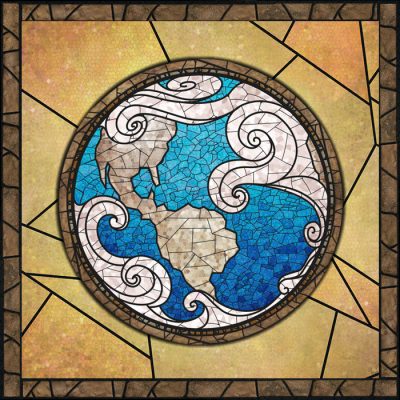
The design was essentially finished back in 2021 but was refined little by little over time until the release of the single for “Return to Dust” and official album announcement. (Final design below)
I’m curious… did the band have any additional input on any of the art concepts?
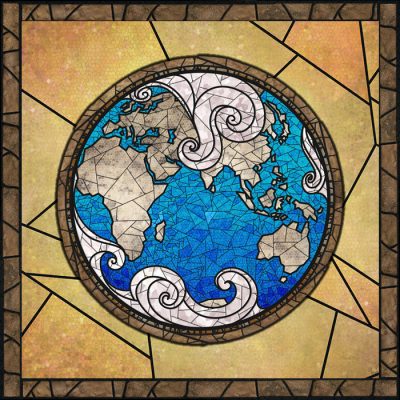
There was also other art for the album (some you just need to buy the album to see for yourself 🙂 ). I also recall having lunch with Ernie and him mentioning wanting to have both hemispheres of the globe for his drum kit (I had previously only done the Western hemisphere for the cover), and I really appreciate him asking for it as it now appears not only on his drum kit, but also on the CD and vinyl discs.
I also, in keeping with the mosaic theme, personally wanted to create mosaic portraits for the band.
Thank you so much steven… any closing thoughts on the experience overall or the album itself?
It has been a blast getting to work with and know the band over these years while creating the art for them. I honestly believe this is their best album yet, and it has been a true delight to hear it progress over the years to where it is today. It is absolutely worth the wait. I hope everyone enjoys the art and, more importantly, the music and that it helps you reflect on how incredible our God is in His grand design while rocking out to some great metal by arguably one of the greatest metal bands out there!

